Greg Cafe
Product definition and design for the site of a chain of roughly 120 branches, at a time when most chain sites in Israel still looked like a catalogue. A fully custom design, not a template.
2015, at True advertising agency.
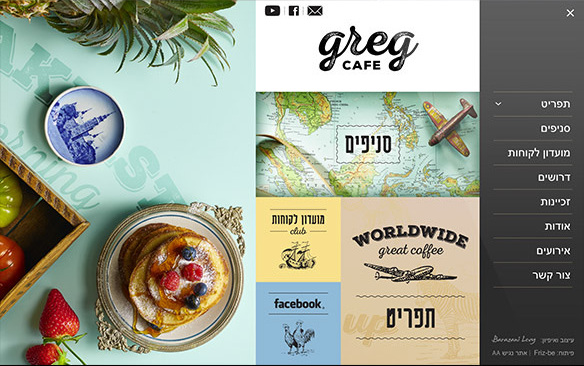
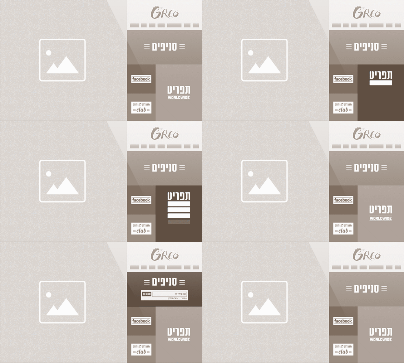
Why this was ahead of its time
In 2015 most food chain sites in Israel were catalogues: a menu, a branch list, a form. Here we went for a rich visual language built on photography, illustration and typography, and a tile grid that is both the navigation and the content. The site ran on WordPress, but with no template: every screen was defined and designed from scratch.
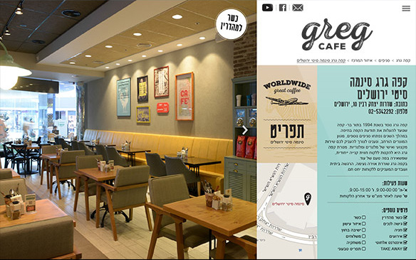
The real challenge was scale. Around 120 branches, each needing a page with hours, location, kosher status, accessibility and shifting attributes, without the system falling apart and without the pages reading like a form.
Where it is today
The site is no longer live. Greg Cafe has replaced it since. What remains is this record, and I keep it here because the work stands on its own.