I treated design as a growth engine. The customer base doubled.
iCount was a successful 14-year-old product with room to grow its brand and experience. I took ownership of brand, product, and the team behind both, and let the results speak.
iCount, an Israeli accounting SaaS that was already 14 years old.
June 2021 to July 2025, four years.
How I made design matter in the company
I came to iCount through a Facebook post: they were looking for someone to make a micro-interaction video, a small one-day project. After a short paid test they offered me an animator job. I told them it was like hiring a chef and asking only for dessert, and proposed to lead all of design instead. I started three days a week, as an independent business, and moved to full time from there.
How I explained my place in the company's process to the CEO and owners:
Idea
I came in here
Design was called in here
Finished product
From there design became an engine, part of planning the product and not a layer added at the end.
Not by force. I came in as an advisor, with a business reason and not only an aesthetic one. And my rule: if I got 80% of what I wanted, that is enough to keep going.
The result
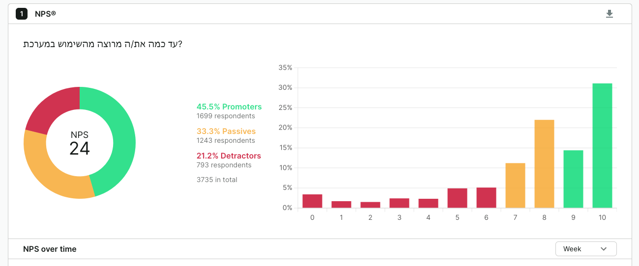
40K customers became 80K+. SaaS revenue grew +135%. An NPS program that didn't exist now tracks 3,735 users and feeds the roadmap.
2021 to 2025. The base doubled, and design was the lever.
A strong product.I built the brand to match.
A 14-year-old SaaS with a loyal customer base and real momentum. I saw an opportunity: bring the brand and the experience up to the level of the product. So I took ownership of the whole experience, from brand, through UX, to the team that ships it.
NPS program establishedUser research culture built from zero
+135% SaaS growthOver the full 4-year engagement
3,735
Users measured in the NPS program. Built and owned end-to-end: tooling, survey design, tracking over time, and feeding insights back into the product roadmap. NPS went from unmeasured to a strategic input.
The NPS program I built: 3,735 users, tracked over time
The rebrand
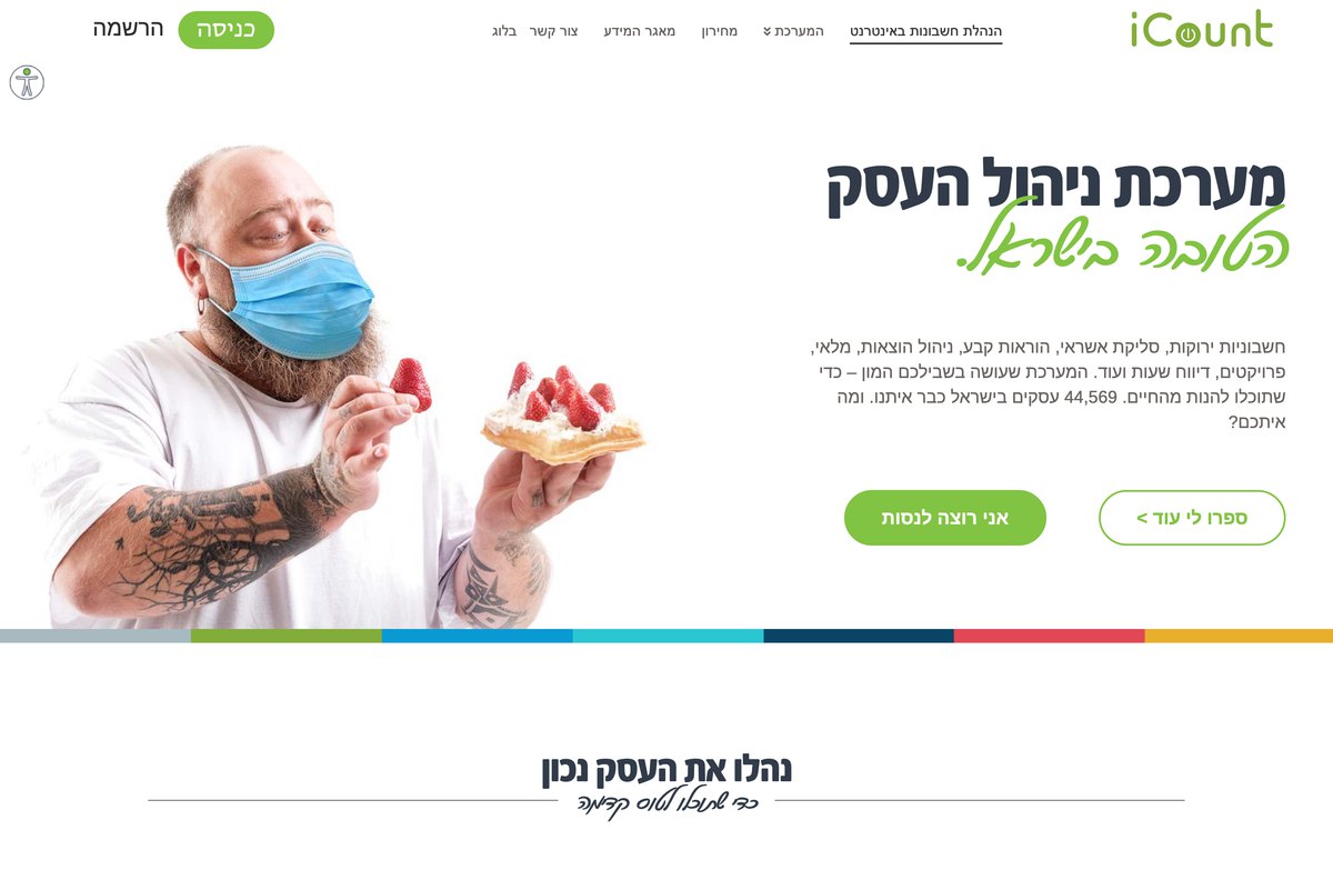
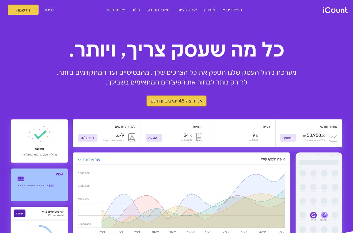
Same company, two eras. The iCount homepage before I joined, next to the one after the redesign: from the earlier green identity to a purple brand built on its values: accessibility, flexibility, ambition, and value for money.
Before
→
After
My favicon test: is there one element of the logo that can sit in a favicon and still be recognized?
iCount
Before
After
Brand strategy
Before the color and the logo, we defined the voice. In a grey world of VAT, accountants and tax authorities, iCount became the other voice: "Hey, I'm with you. I'm here for you."
From the iCount brand voice guide
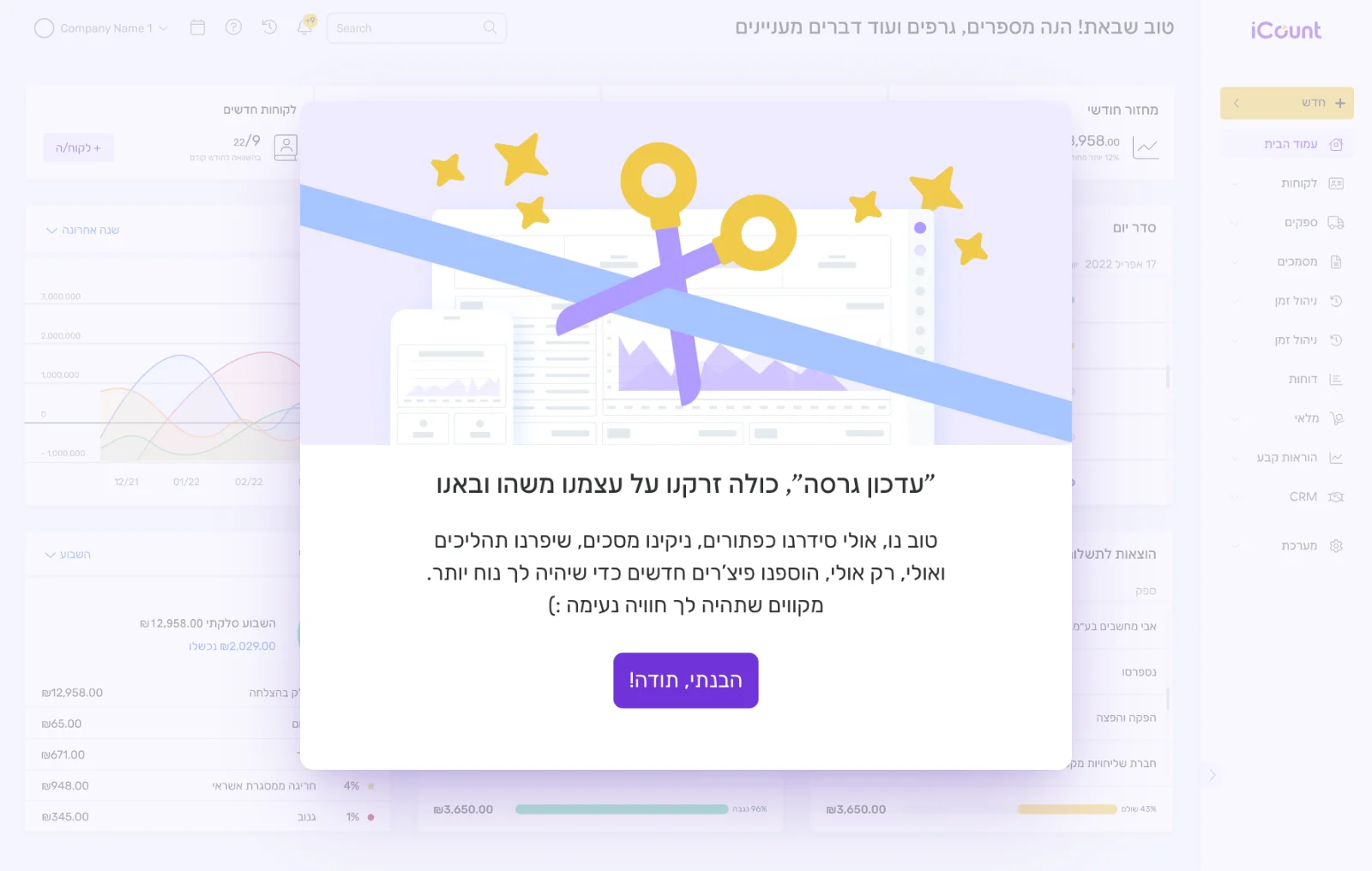
The voice, shipped: a release note at eye level, not a system alert
The brand system I built
Not just a logo. A full language: identity, color, and a warm illustration set, in a grey world of tax. Straight from the brand book I authored.
The iCount brand book I wrote
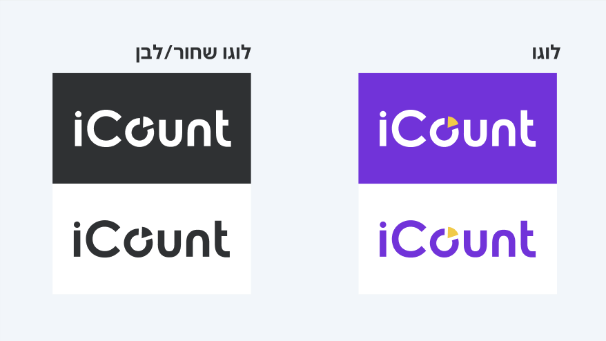
The logo system, across surfaces
The illustration language
The product, redesigned
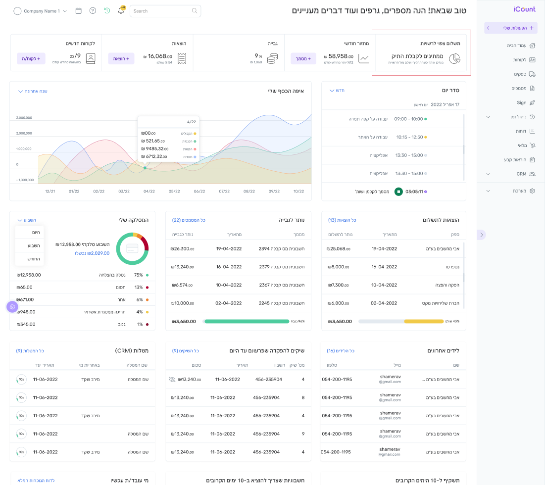
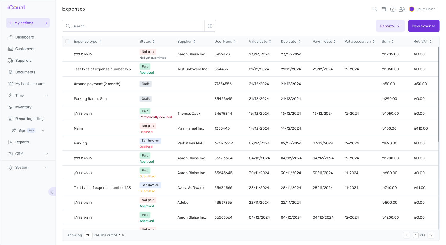
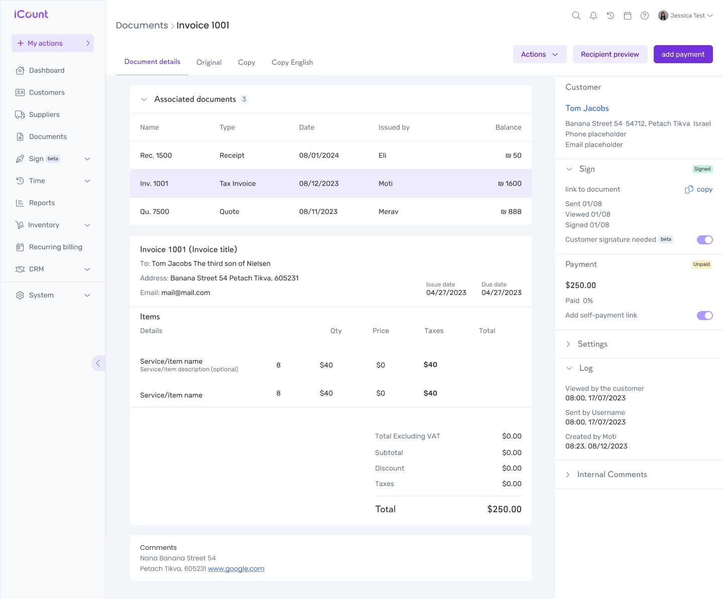
Real screens from the redesigned product, on web and mobile: dashboard, expenses, invoicing, and onboarding. One consistent brand, end to end.
The dashboard: the whole business at a glance
Expenses, rebuilt
Invoicing, end to end
The team I built
I didn't do it alone. I built the team from scratch and hired every one of them myself, in the order I brought them on. Some grew into leaders. A brilliant team, true players with big hearts.
The team wasn't only designers. It had motion, web development and copy, with marketing alongside us. Together we built the marketing site and everything around it, the place where people realize they need the product, sign up and pay. At that scale, it couldn't have happened with one person.
01GZ
Gal ZuzutNow CMOFrom copywriter to Creative Lead, grew on my team