Making Israel's metropolitan public transport actually usable
Intercity public transport that people can actually use.
2016.
A note, looking back
This was designed in Photoshop. Yes, Photoshop - layers, flat exports, PDFs handed off by email. I'm basically a design dinosaur. A dinosaur who somehow ended up building her own portfolio in a live conversation with an AI. Back then I could only fantasize about a creative-technical partner like that. That partner turned out to be Claude.
Merav Shaked, 2026
Metropolin is Israel's second-largest public transport company, serving the metropolitan area with hundreds of bus lines. The existing website made it genuinely hard to do the one thing users needed: figure out how to get somewhere. I led this project end-to-end at True Adv, from user research and competitive analysis through information architecture, wireframes for both desktop and mobile, and the full visual design.
The Challenge
2nd
Largest metropolitan transport provider in Israel
3
Distinct user types, each needing a different search experience
2
Platforms redesigned from scratch: desktop and mobile
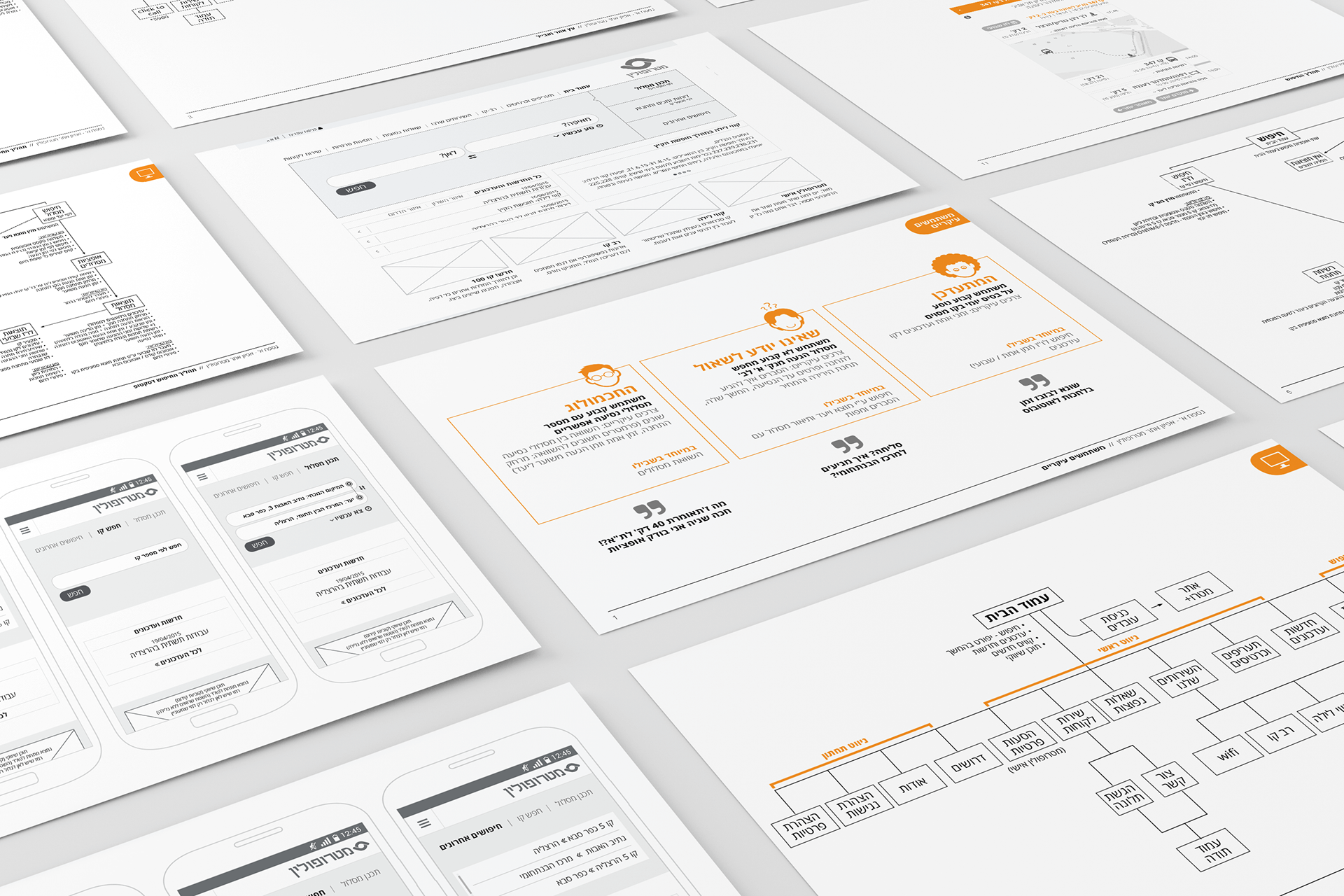
User Research
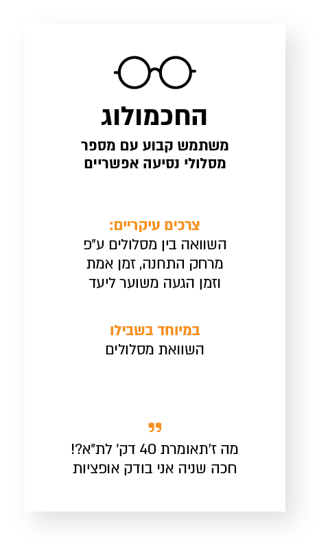
Omer, 31
Software developer, Ra'anana
The Optimizer
Commutes to Tel Aviv daily. Always has three browser tabs open and won't board a bus without comparing his options first.
Compare multiple routes side by side
Distance, real-time arrival, estimated time, price
Maps, route explanations, live updates
40 minutes to Tel Aviv?! Hold on, let me check other options.
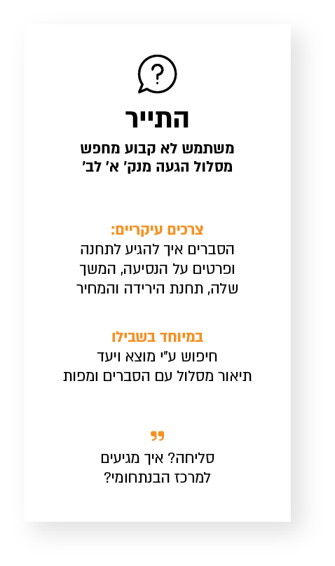
Ruth, 55
Retired teacher, Herzliya
The One Who Doesn't Know to Ask
Takes the bus a few times a year to visit family. Every trip feels new. She needs to be walked through the whole thing.
Full A-to-B route description
Step-by-step: stop, walking, continuation
Maps, clear explanations, fare info
Excuse me, how do I get to the Intermunicipal Center?
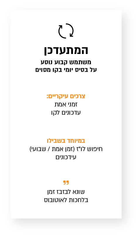
Dana, 24
Student, Ra'anana
The Commuter
Line 347, every morning, no exceptions. She knows her route cold, she just needs to know if the bus is actually on time.
Real-time arrival for her specific line
Weekly timetable at a glance
No searching, just live status and times
I hate wasting time waiting for a late bus.
The survey gave us 400 real responses in two weeks. The data made one thing clear: users were arriving at the same site with completely different needs. The Optimizer wants to evaluate options and pick the best. The One Who Doesn't Know to Ask needs to be walked through the whole journey. The Commuter already knows their line and just wants to know if the bus is on time. Each persona shaped a different entry point in the redesigned navigation.
Information Architecture
One search barRoute plannerThe Optimizer and the One Who Doesn't Know to AskSearch by lineThe Commuter
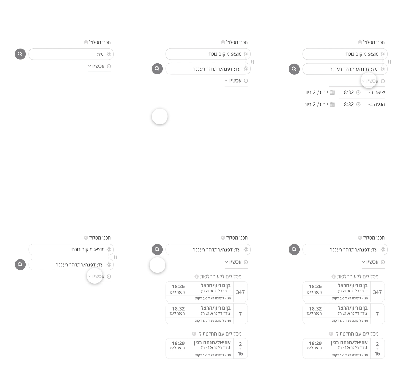
Route Planner (by origin + destination)
Text autocomplete for stops
Search by departure or arrival time
Compare routes with/without transfers
Real-time arrival at nearest stop
Walking time + map to stop
Breadcrumb navigation throughout
Timetable Search (by line number)
Line number autocomplete with direction
Daily or weekly timetable view
Stop selection along the route
Real-time updates per line
Departure/arrival time table
Previous/next bus navigation
Design System
Color Palette
#f5911e
#eb7d23
#faaf5f
#464646
#a5a5a5
#ebebeb
Typography
H1 / 20px Bold
Page Title
H2 / 18px Regular
Section Heading
H3 / 16px Regular
Subsection
Body / 16px Regular
Open Sans Hebrew
Interactive Elements
Plan a RoutePlan a Route (hover)
Buttons: Open Sans Hebrew ExtraBold, 24px, radius 30px, #f5911e. Hover state adds inner shadow at 7px in #eb7d23.
Persona Icons
The Optimizer
The Commuter
The One Who Doesn't Know to Ask
UX Process
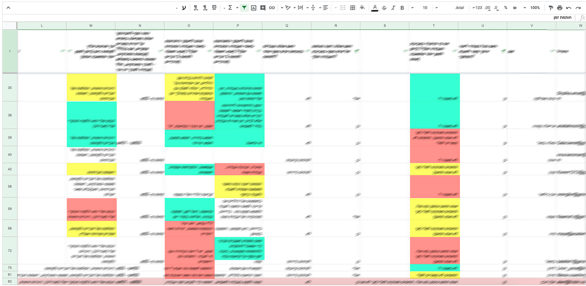
At first, for budget reasons, interviews with users were not possible. So I demanded to distribute a poll. Everyone was skeptical, but I insisted. The survey was distributed as a simple banner on the old site. The response was high, and within two weeks, about 400 users responded.
From there, I began to draw conclusions about the motives and needs of our primary personas.
Final Design
Interaction Walkthrough
Outcome
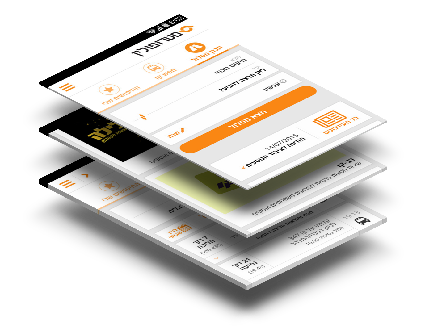
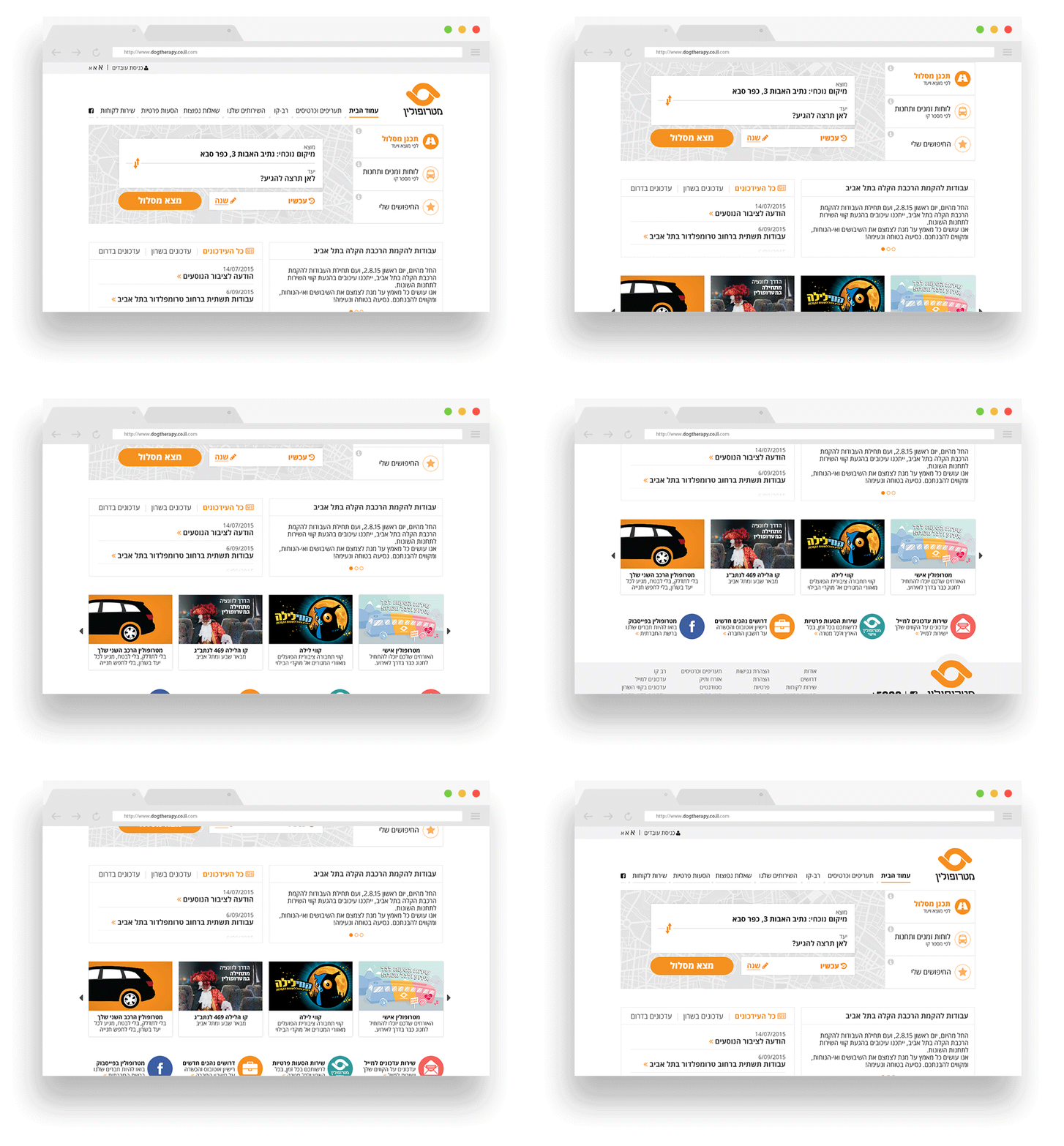
The redesign replaced a confusing tangle of pages with two clear entry points: plan a route by origin and destination, or look up a line directly by number. Every screen answered a real question a real user had. The visual system brought Metropolin's orange identity forward in a way that felt modern and confident, not just corporate.